
Where a preview helps
- Separating orange-gold warmth from true red saturation
- Choosing brightness and depth before a color consultation
- Planning refresh frequency and fade expectations
Side-by-side hairstyle decision guide
Copper leans toward orange and gold; red places more emphasis on true red pigment and can range from bright to deep. At the same depth, copper often looks lighter and more reflective, while red feels richer and more saturated.
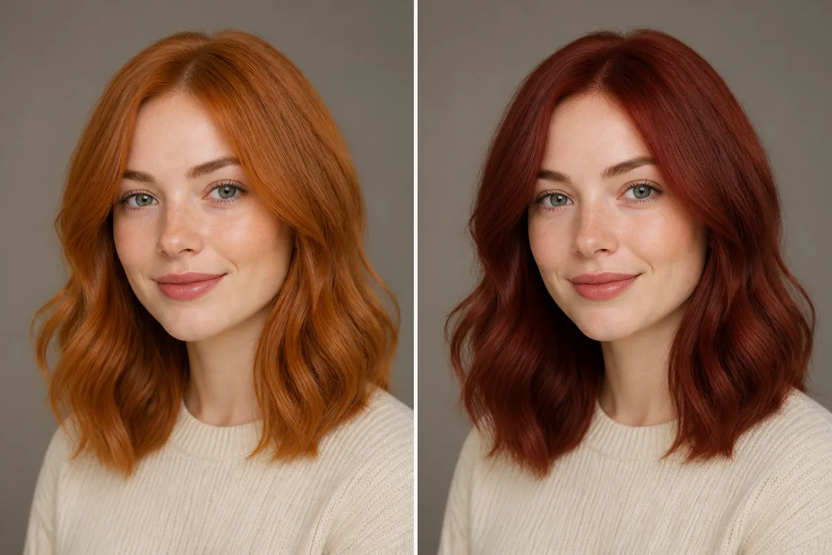 CopperRed
Before the appointment
Keep the hairstyle and lighting identical, then compare tone near the roots, face, and ends. Both colors fade and shift, particularly on porous hair. A colorist must assess the starting base, previous dye, and whether lightening is needed before choosing a formula.
| Decision point | Copper | Red |
|---|---|---|
| Dominant tone | Orange and gold | True red pigment |
| Typical impression | Bright and reflective | Rich and saturated |
| Fade direction | Can soften toward gold | Can lose red intensity |
| Consultation focus | Brightness and orange balance | Depth and red saturation |
What to tell your stylist or barber
Describe the target with depth and tone together: light copper, muted copper, bright red, or deep red. Ask how the color is expected to fade and which at-home products are appropriate.
Photo setup
Photograph current hair in indirect daylight and avoid warm bulbs. Include roots and ends; otherwise the preview hides useful information about the starting base.
In the Android app
Use a front-facing photo with your face and hairline visible in even light.
Choose a haircut, hairstyle, or hair color and let Glowify create the preview.
Keep favorite before-and-after results as a starting point for your salon or barber conversation.
Common questions
The terms overlap in everyday use, but salon references vary. Show the exact balance of orange, gold, and red you want instead of relying on one label.
Copper often appears brighter at the same depth because of its orange-gold reflection. Lighting and the selected formula can reverse that impression.
Both can lose vibrancy. Ask the colorist about wash temperature, product choice, heat exposure, sun, and the appropriate refresh schedule.
Nearby options
Use the alternatives below to isolate the detail that matters most to your decision.
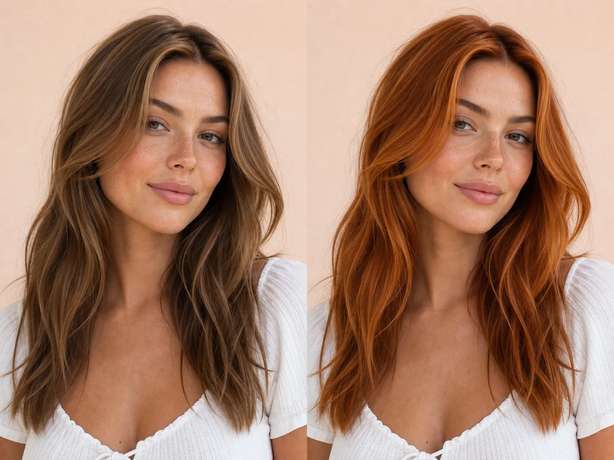
Copper sits between golden orange and red, with versions ranging from soft strawberry copper to saturated penny tones. Small shifts in depth can make the result feel natural or statement-making.
Explore this look →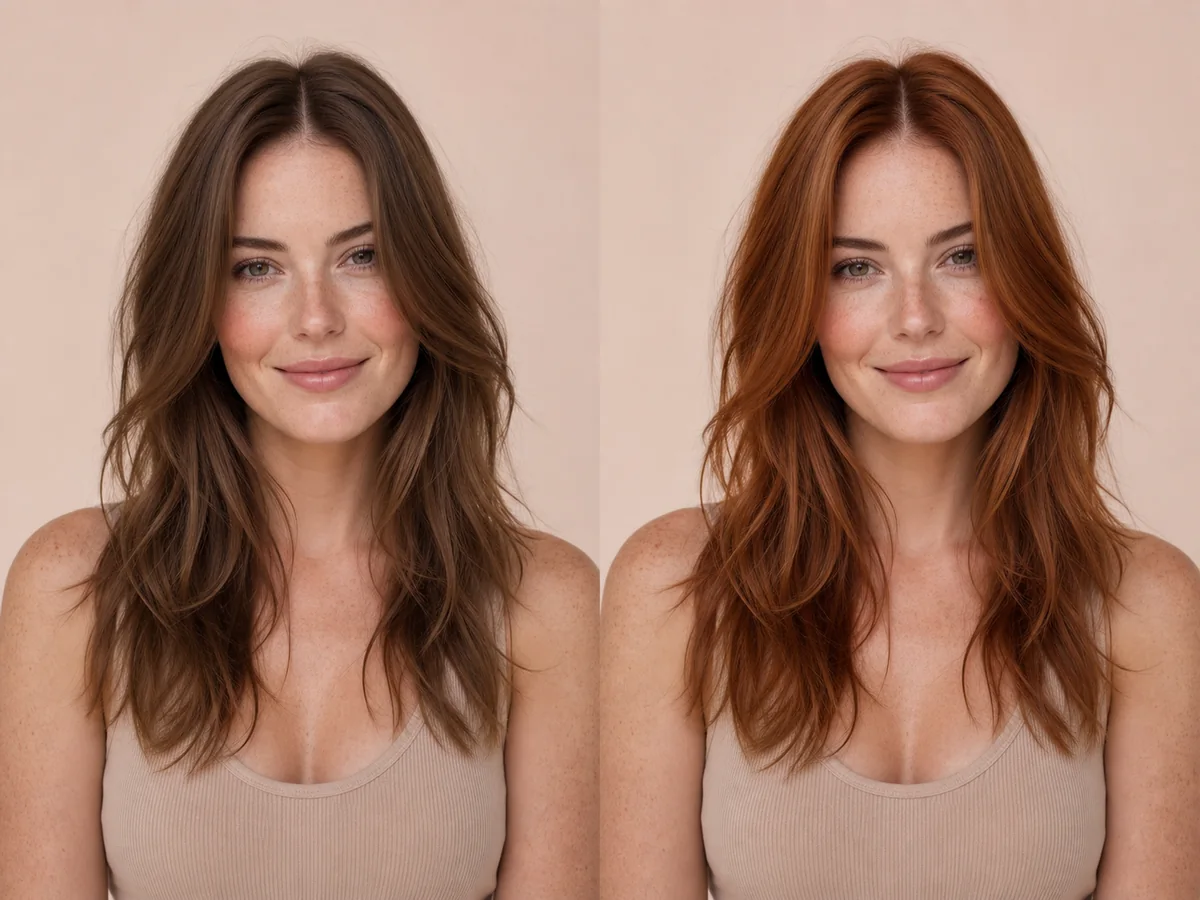
Red hair can range from quiet auburn to clear copper or vivid fashion red. The balance of orange, red, brown, and violet determines how natural or bold the result feels.
Explore this look →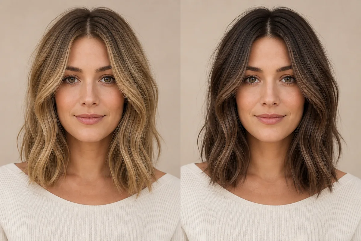
Blonde reflects more light and usually lowers the depth around the face; brunette creates a deeper frame and often stronger contrast. Neither family is one shade, so compare similar undertones before deciding whether lightness or depth is the real preference.
Explore this look →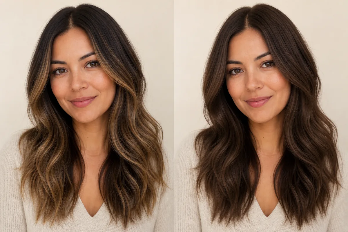
Balayage places selected lighter or different-toned pieces through the hair, usually preserving depth at the root. Full color changes the overall field more consistently. The decision is about placement and contrast as much as the chosen shade.
Explore this look →Take the next step
Open Glowify on Android, compare the result, and bring the useful details to your stylist or barber.